How to highlight your products with flash-tags in Woocommerce

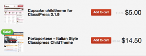
If you use woo commerce, you may have noticed that the plugin uses a nice flash-tag to highlight the products with Sale price. Depending on your theme, this tag will look different, this is an example:

This is a nice addition, but after some months we felt we needed some extra flash-tags like this one to offer our clients some important information about the product at home page without force them to click on the product link. If you have a lot of returning customers , that’s a good point because you can create a flash-tag for instance to announce a ‘coming soon’ product or an ‘updated’ product. After thinking about it, I decided ti implement a easy method to add extra flash-tags to our shop page. This process require some coding and ideally should be implemented as a plugin, but in the meanwhile, this small step by step will work 🙂
- Step 1: The easiest way to control the flash-tag for each product is to use a custom field, so the first we need os to add a simple php function in our theme functions.php:
add_action('woocommerce_after_shop_loop_item', 'my_print_coming_soon' );

function my_print_coming_soon()

{

global $product, $post;
if (get_post_meta($product->id, ‘product_coming_soon’, true)== 1)
echo apply_filters(‘woocommerce_coming_flash’, ‘<span class=”coming_soon”>’.__( ‘Coming soon!’, ‘woocommerce’ ).'</span>’, $post, $product);
}
With this hook, if your product has a custom field called ‘product_coming_soon’ with value 1, then the tag will appear in our product thumbnail.
- Step 2: Now, we need to style the flash-tag. This is just an example of how it looks on a custom version of woostore theme. let’s say we want our tag based on blue tones, so let’s code:
ul.products li span.coming_soon {

font-size: 16px;

padding: 2px 9px 4px;

}

.coming_soon {

background-color: #0000ff;

background-image: -webkit-gradient(linear, left top, left bottom, from(rgb(238, 130,130)), to(#0000ff)); /* Saf4+, Chrome */

background-image: -webkit-linear-gradient(top, rgb(130, 130,238), #0000ff); /* Chrome 10+, Saf5.1+ */

background-image: -moz-linear-gradient(top, rgb(130, 130,238), #0000ff); /* FF3.6 */

background-image: -ms-linear-gradient(top, rgb(130, 130,238), #0000ff); /* IE10 */

background-image: -o-linear-gradient(top, rgb(130, 130,238), #0000ff); /* Opera 11.10+ */

background-image: linear-gradient(top, rgb(130, 130,238), #0000ff);

filter: progid:DXImageTransform.Microsoft.gradient(startColorStr='#96c42e', EndColorStr='#2ab536');

border:1px solid #0000ff;

position: absolute;

top:5px;

left:5px;

padding:1px 6px;

font-size:11px;

text-align: center;

font-weight: bold;

color:#fff;

-webkit-border-radius:20px;

-moz-border-radius:20px;

-o-border-radius:20px;

border-radius:20px;

z-index: 999;

text-shadow: 0 1px 0 rgba(0,0,0,0.1);

-webkit-box-shadow:

inset 0 0 0 1px rgba(255,255,255,0.4),

0 1px 2px rgba(0,0,0,0.2);

-moz-box-shadow:

inset 0 0 0 1px rgba(255,255,255,0.4),

0 1px 2px rgba(0,0,0,0.2);

box-shadow:

inset 0 0 0 1px rgba(255,255,255,0.4),

0 1px 2px rgba(0,0,0,0.2);

}
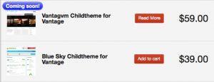
At the end, simply adding a custom field to your product you will get this result:

